Vivevive Celebrates The Female Form
Vivevive is a Korean period underwear company that strives to change the stigma of period products and promote joyful, elegant and comfortable underwear for the women who wear them.
This mission starts with the name, as vive translates to "lives" in Spanish because while periods can be inconvenient, the products you use should not impede you from living your life (vive also translates to “hurrah” in French).

To produce packaging and branding that communicates this message effectively, Vivevive commissioned ContentFormContext (CFC), a multidisciplinary design and photography studio based in Seoul, Korea to complete the project.
"As all the designers in charge of the project were female, we were able to freely discuss our thoughts on the product during our menstrual period versus regular underwear and other products," says Charry Jeon, art director at CFC. "We decided that since the product was both comfortable and beautiful, the packaging should be the same. To take it a step further, we thought it should be elegant and cheerful as well."
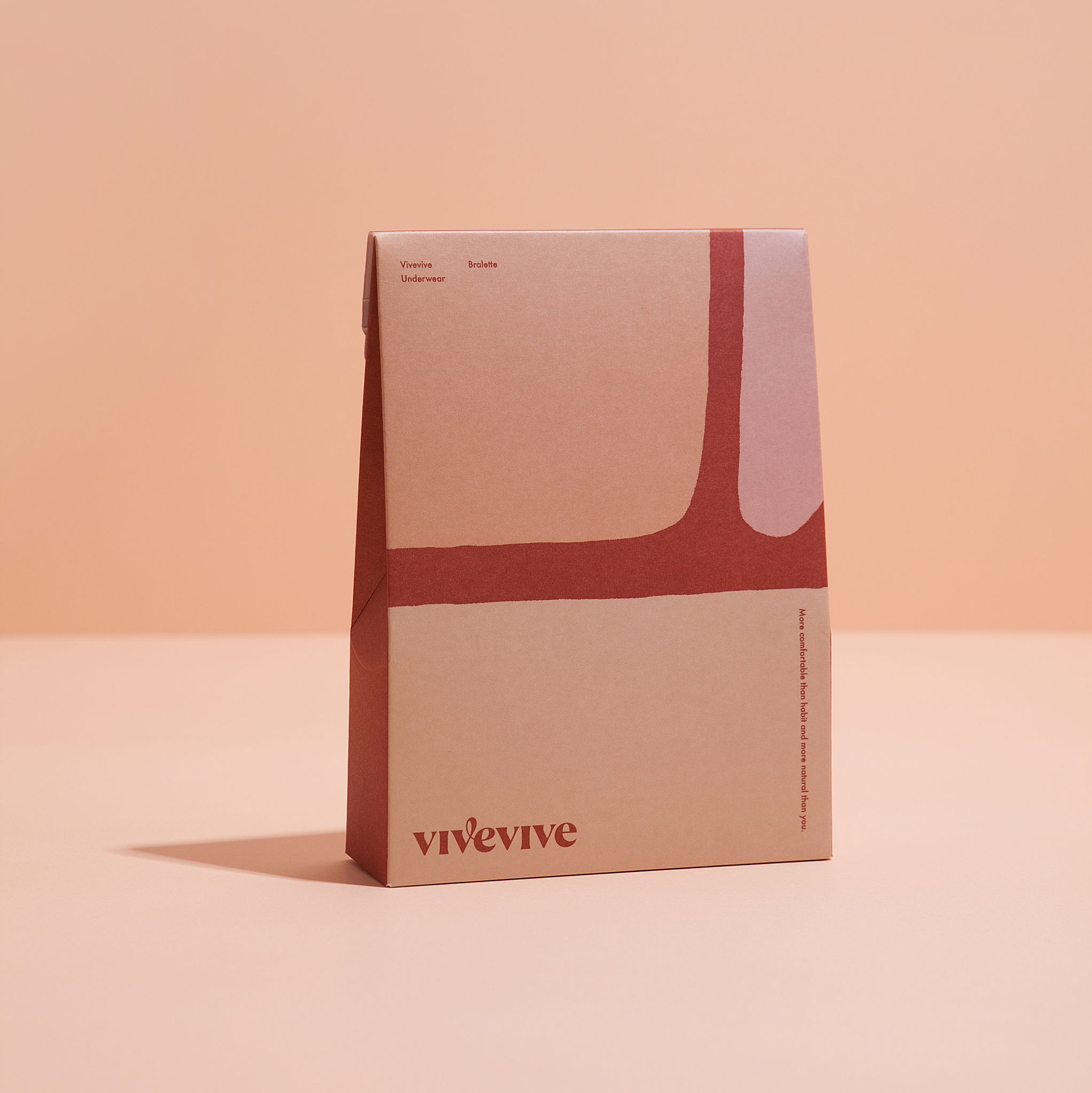
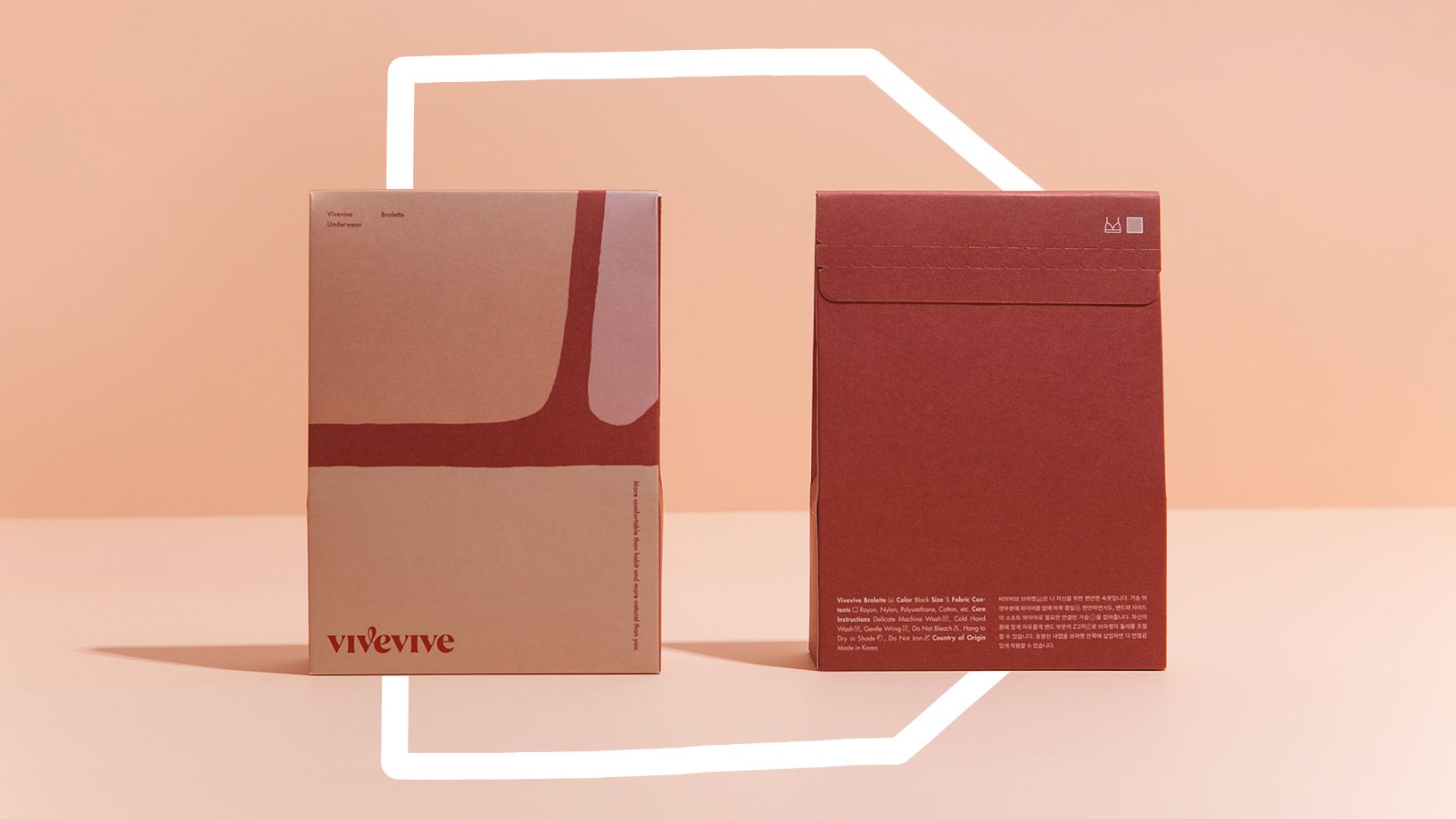
The goal—and simultaneously the challenge—was to produce a design that not only conveyed the brand's message but one that found the perfect balance between size, color, typography and logo against an abstract color-field.
"We believe that the most natural is the most beautiful thing, and we built the branding off of this belief," states Jeon. "The natural curves found in a woman's body have beauty in themselves. So, we zoomed in on that and tried to express the curves that appeared in the form of an abstract-color field."
To emulate this, CFC hit the sketchbook and began drawing a series of rough ideas by hand. From there, they utilized their iPads and tested out the different sketches with various colors until they landed on the design you see today.
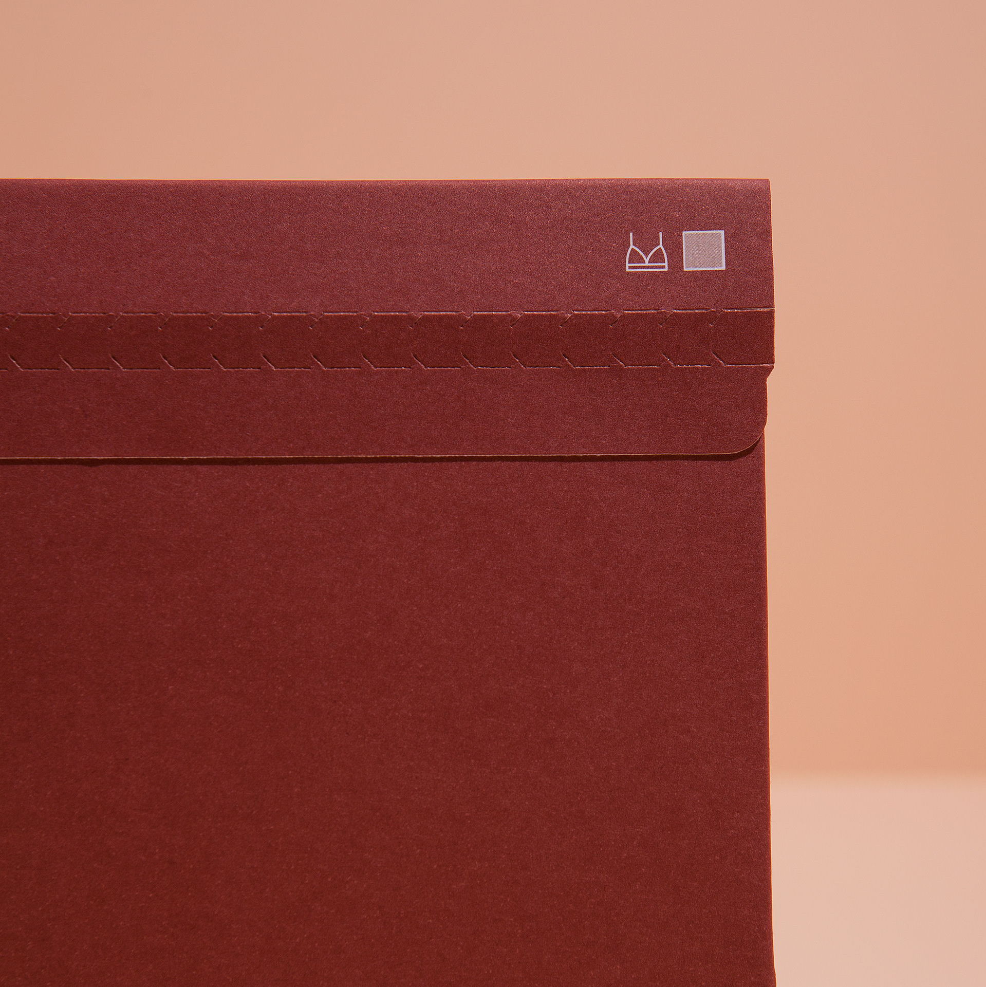
"Once the abstract field was complete, we ran multiple tests to determine the perfect package size suitable for housing the underwear inside and the graphics on the exterior of the box," states Jeon. "To supplement our rather flat graphics, we added points to the wordmark to balance the brand identity and design."

At first glance, the packaging looks like an abstract with different shapes in complementing colors. Look closer, and you'll see the design is either a profile of a woman wearing a maroon bra or dark blue underwear in varying styles like bikini, brief and high-waisted. All of which was inspired by the way the products interact with the female form as it moves throughout the day.

"Underwear, especially menstrual panties, may not be something most women want to reveal," says Jeon. "So, I was most proud to create a design that displays the authentic shape of a woman wearing this product. It is pleasing that this design delivers natural beauty in itself."
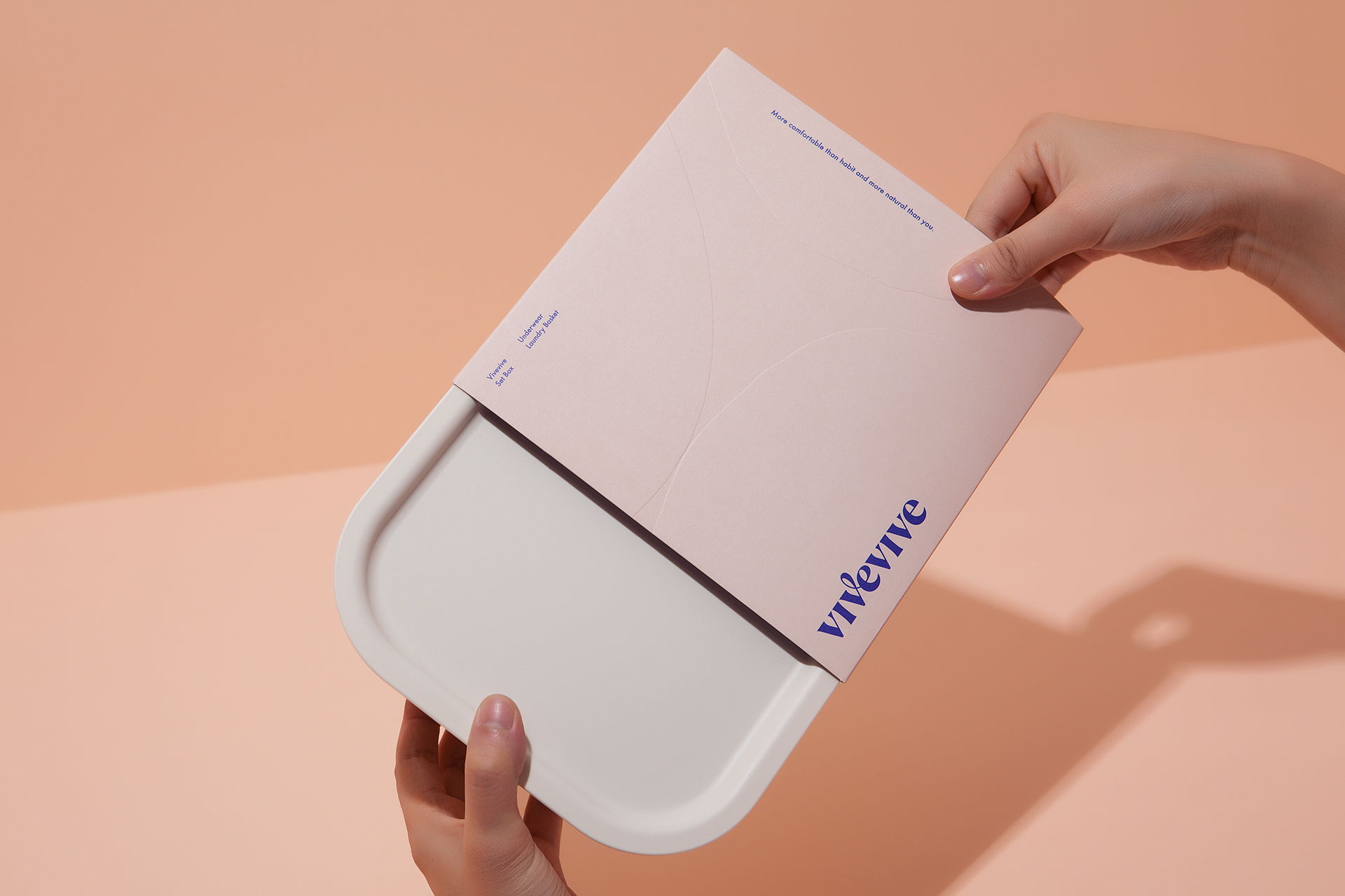
Vivevive not only serves up refined packaging and comfy underwear, but they're also delivering confidence with their mission, "more comfortable than habit and more natural than you."
Let's be real though. You don't choose the period life; the period life chooses you. You might as well embrace the products and brands who choose to welcome you.
