Pack of the Month: Camino Gummies Transport You To The El Camino Royal

Created by California-based Kiva Confections founders Scott Palmer and Kristi Knoblich, Camino is a cannabis-infused gummy collection dedicated to paying homage to all Mother Earth has to offer alongside the El Camino Real, a 600-mile stretch of road from San Diego to the south of Sonoma.
As this project hits close to home, Kiva entrusted Stout, a San-Francisco based design agency they've been working with for the past four years to cultivate their latest product.
"Our biggest goal was to create a line that captured that California State of Mind," says Stout Principal Brian Gunderson. "To do this, we illustrated different landscapes, inspired by both flavor and effect. We wanted to be sure to use color in our favor, not only as a flavor indicator but also as a way to represent the bold and unique flavors of Camino."

Stout began by sharing a variety of design treatments executed in three styles, photographs, graphic designs and illustrations. After Kiva wanted to move forward with illustrations, they pondered ways to keep up with the cannabis regulations which require edible products to not only be sealed in an opaque bag with a childproof zipper but also to follow the labeling checklist for both the primary and informational panel.
The winning idea was a diamond-shape at the top half of the bag that houses all of the branding and necessary information. A few requirements they had to meet were thefont sizes could be no smaller 6point in the panels, a list of ingredients in descending order by weight or volume, and the universal California symbol for cannabis displayed front and center.
"Naturally, that was the biggest challenge – to keep all of the content tightly arranged in a diamond while adhering to the regulations – which felt overwhelming at times," begins Gunderson. "As such, for this design we purposefully kept all the messaging framed tightly within the diamond shape while allowing the illustrations to take as much space as possible on the packaging."
Despite that obstacle, Stout hit the ground running and produced stunning designs that tie each location and specific effect.
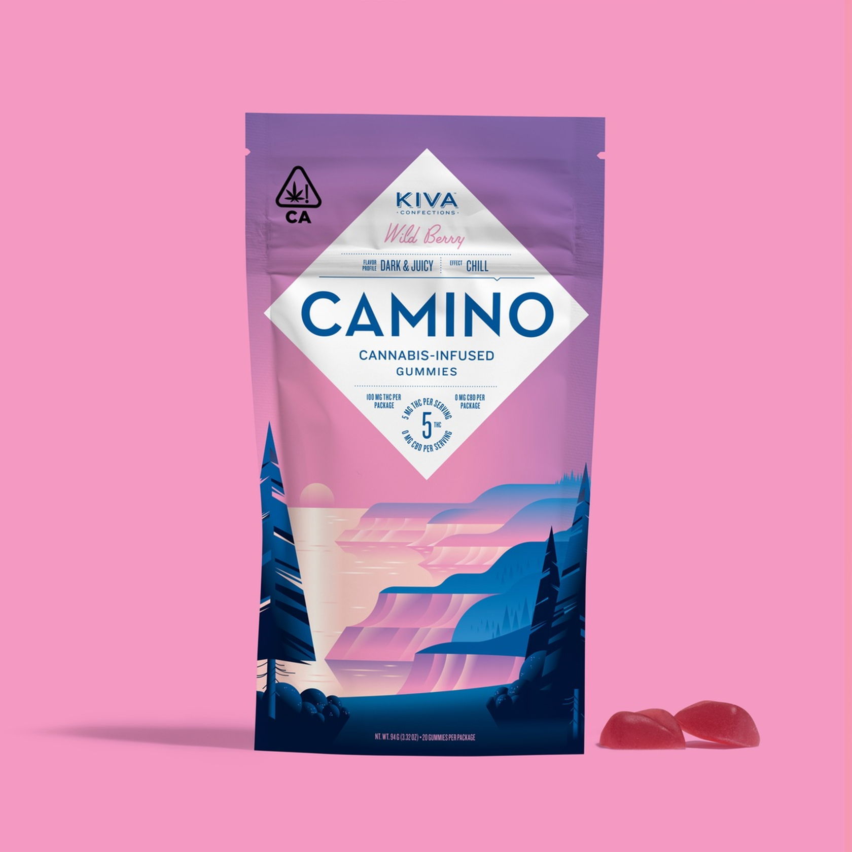
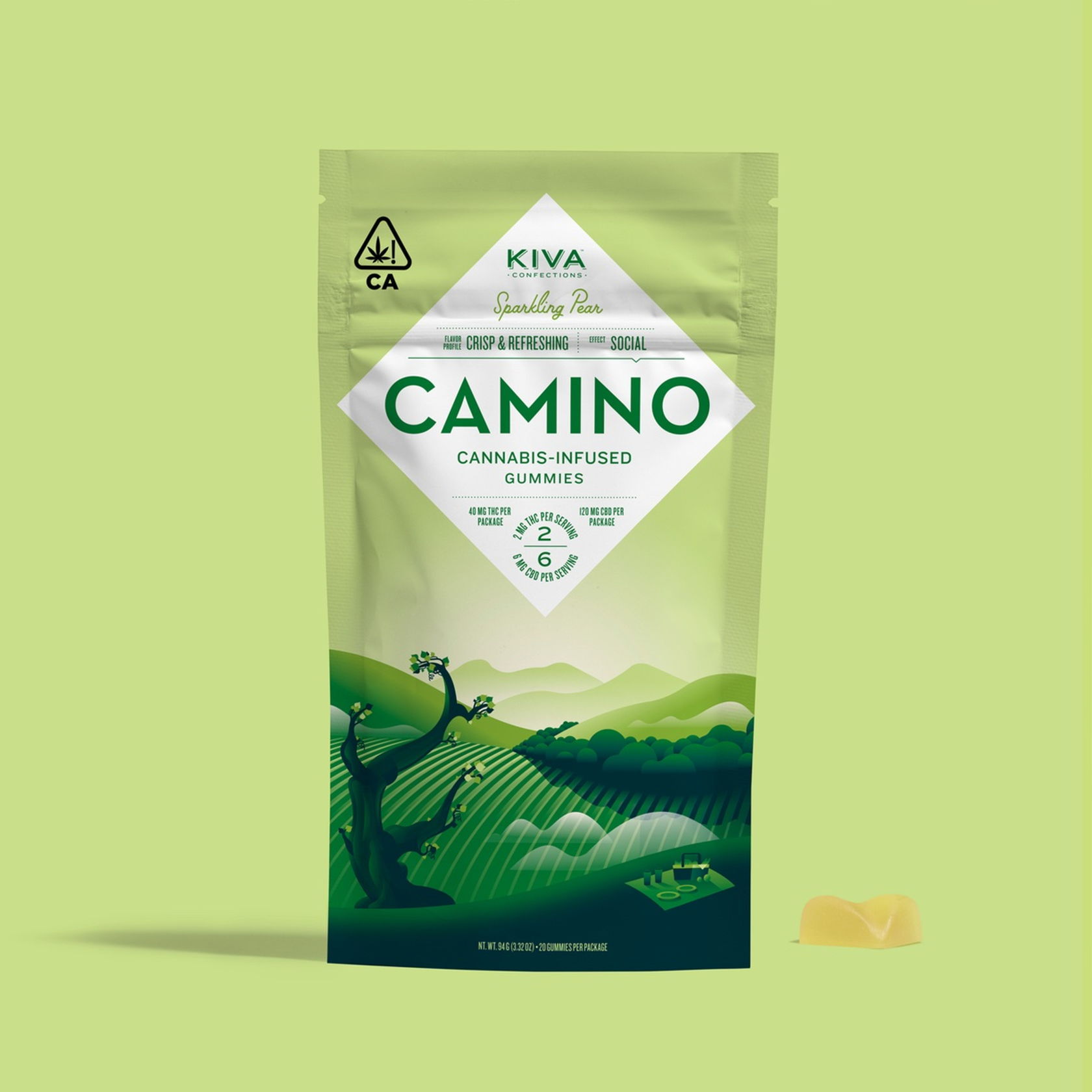
"The Wild Berry package illustrates a relaxing sunset on the Northern California coastline, evoking an overall feeling of a chill effect," Gunderson says. "The Sparkling Pear, a picnic scene overlooking wine country as this flavor, contains a higher amount of CBD which allows the user to feel the euphoric high without the anxiety.
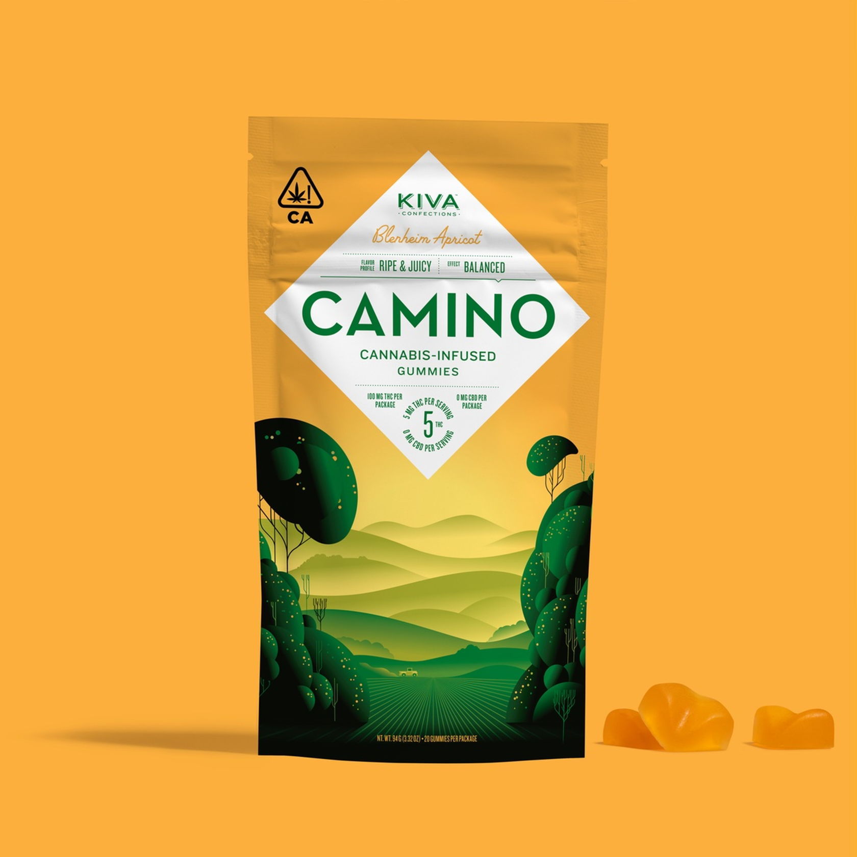
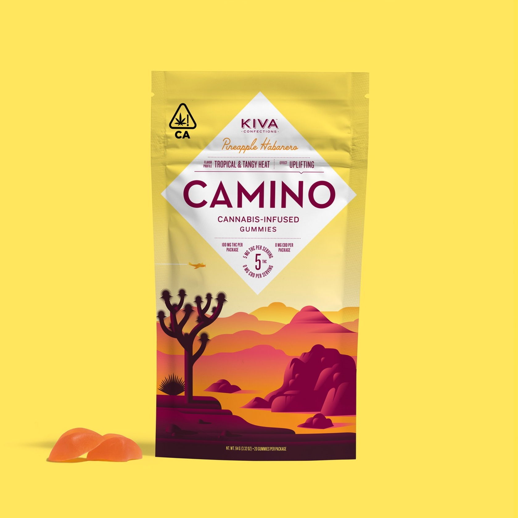
“The Blenheim Apricot is set on a calming, symmetrical apricot orchard in Northern California, evoking a feeling of balance and control. Lastly, the Pineapple Habanero package illustrates a bright Mojave desert scene, hinting at the sweet pineapple and hot habanero flavors that give an uplifting effect.”
After reflecting on the extensive process that led to these well-executed designs, Stout has a word of advice for any designer or studios producing branding and packaging for cannabis.
"It's very important to have in-depth knowledge on the typography and warning regulations before you get too far along on a path," Gunderson says. "One needs to start designing with the worst-case scenario and gradually design yourself to the best."

Only through placing this much thought and detail into every piece of the packaging, from the illustrations of the locations and color scheme to the diamond that is the same shape of the gummy itself, Stout successfully told the brand story of Camino while also complying with regulations. Each bag from Pineapple Habanero to Sparking Pear transports the consumer to another place as well as announce the flavor you're about to experience before the gummy even hits your mouth.
Are you ready to travel up to El Camino?